


Hiya. This is the third day of learning CSS Grid by building a Magazine. Yesterday, I started learning how to use CSS grids. CSS grids allows for horizontal and vertical arrangement of items by using “display: grid;”. Also learnt the use of grid-template columns which allows you set to as many columns as you want, the minmax function which allows the columns to be responsive on any device, the row-gap property which is used to gap between rows in the grid and the grid-column property which tells the column where to start and where to end. Here are the lessons I learnt today:
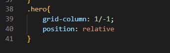
Created a .hero selector and give it a grid-column property set to 1 / -1. This will tell the element to span the full width of the grid.
![Day 56 no1a.png] (https://cdn.hashnode.com/res/hashnode/image/upload/v1661338714888/aIRQScIid.png align="center") Gave the .hero selector a position property set to relative.

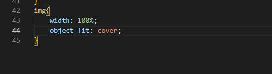
I removed the temporary width attribute before writing the CSS for your .hero-img.
Also created an img selector and give it a width property set to 100%, and an object-fit property set to cover. (The object-fit property tells the browser how to position the element within its container. In this case, cover will set the image to fill the container, cropping as needed to avoid changing the aspect ratio)
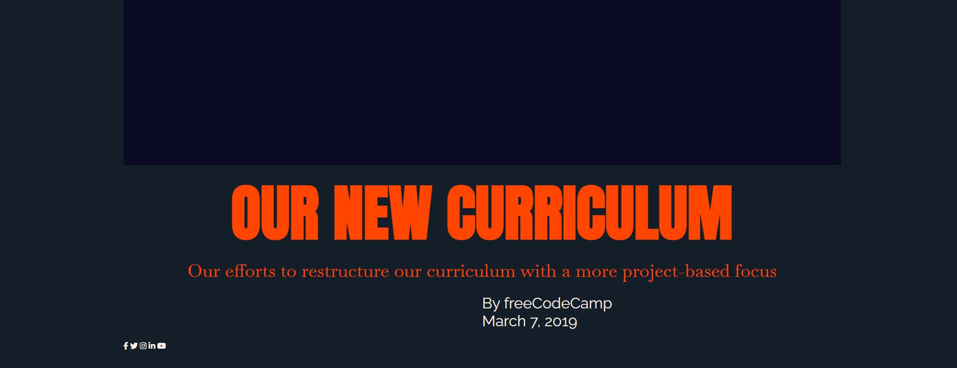
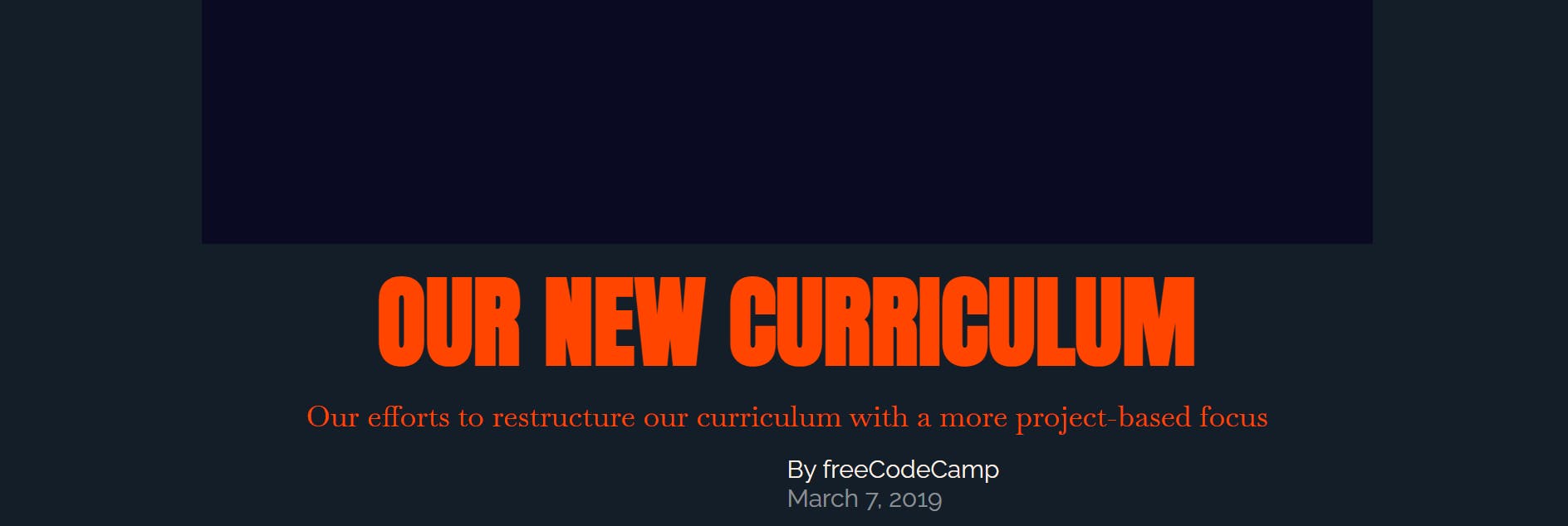
After that .hero-title was styled. I gave it a text-align property set to center, a color property set to orangered and a font-size property set to 8rem.
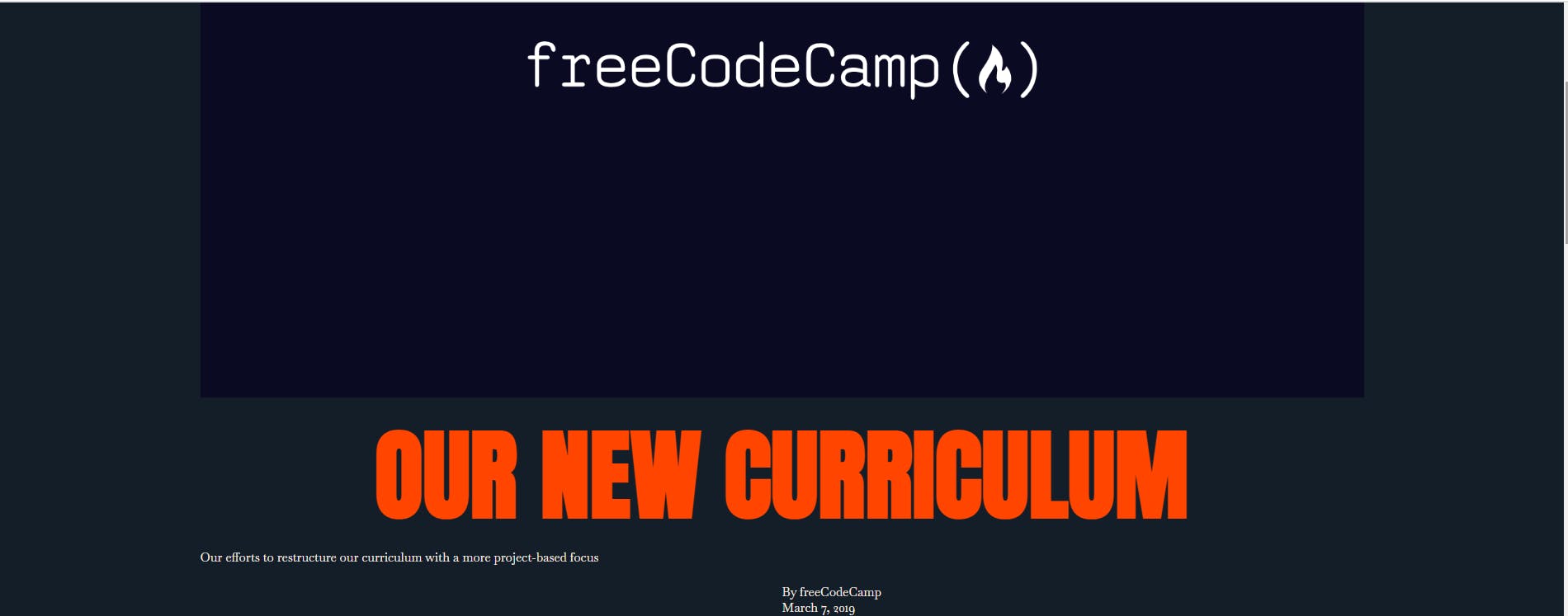
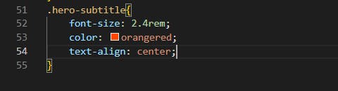
- Styled the class .hero-subtitle and gave it a font-size property set to 2.4rem, a color property set to orangered, and a text-align property set to center.

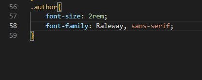
- Created an .author selector and gave it a font-size property set to 2rem and a font-family property set to Raleway with a fallback of sans-serif.
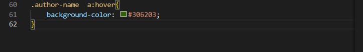
- Worked next on the class a .author-name a:hover. I gave it a background-color property set to #306203. (This will create a hover effect only for the a element within the .author-name, showing the original freeCodeCamp green in the background.)
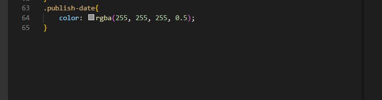
- Next, I styled .publish-date selector and give it a color property of rgba(255, 255, 255, 0.5).
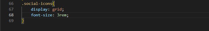
- Created a .social-icons selector. Gave it a display property set to grid, and a font-size property set to 3rem.
 Thank you for reading. Don't forget to leave a comment. See ya tomorrow.