


Its Day 14 my dear people. Glad for the consistency. Today, I moved into a new section - Learning CSS Flexbox by building a photo gallery. My 5 lessons are:
- Flexbox helps you design your webpage so that it looks good on your webpage.
- Using the box-sizing property.
- Flexbox is a one-dimensional CSS layout approach that focuses on the flow of content. It offers the ability to control the way items are spaced and aligned within a container.
- Flexbox can be thought of as having two axes, the main axis and the cross axis. The main axis is determined by the flex-direction property. If flex-direction is set to row or row-reverse, the main axis is horizontal. If flex-direction is set to column or column-reverse, the main axis is vertical.
- The flex-wrap property determines how your items should behave when the flex container is too small. Setting this property to wrap will allow your items to wrap to the next row/column (depending on your main axis), where nowrap will prevent your items from wrapping. When this is set to nowrap, items may either shrink to fit or overflow.
- The align-items property positions the flex content along the cross axis.
- you can use the object-fit property to determine how images should behave.
Check out the work : onose12.github.io/css-flexbox
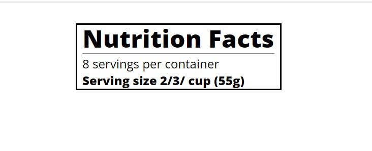
To complete my 10 lessons for the day, I had to continue learning. Hence I moved to a new section: Learning Typography by building a nutrition label.
- Typography is the art of styling your text to be easily readable and suit its purpose.
- h1, h2, and similar tags determine the semantic structure of your HTML. However, you can adjust the CSS of these elements to control the visual flow and hierarchy.
- Horizontal spacing between equally important elements can increase the readability of your text.
The html, CSS and webpage of the work on typography