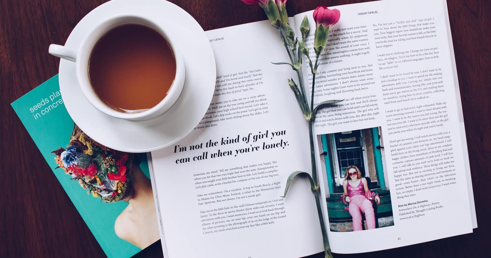
Hi people. I am continuing with applying CSS grids. Here are the 10 steps I took today.
- Created a selector, and gave it a text-decoration property set to none and a color property set to linen.

- Time to start putting together the grid layout. CSS Grid offers a two-dimensional grid-based layout, allowing you to center items horizontally and vertically while still retaining control to do things like overlap elements. Began by creating a main selector and giving it a display property set to grid.

- I set the content to have a three-column layout by adding a grid-template-columns property with a value of 1fr 94rem 1fr. This will create three columns where the middle column is 94rem wide, and the first and last columns are both 1 fraction of the remaining space in the grid container.
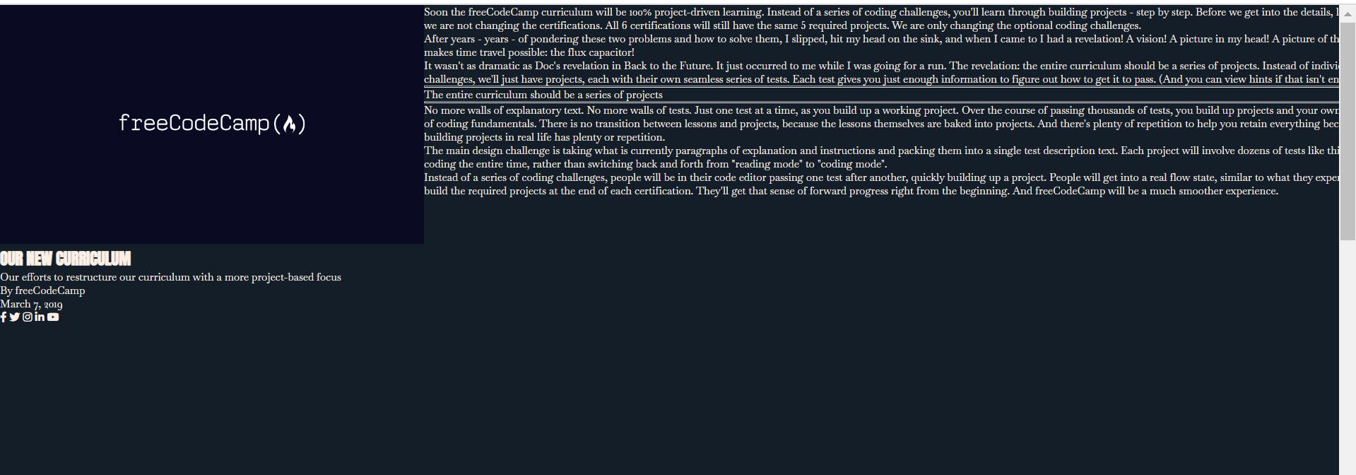
- Used the minmax function to make the columns responsive on any device. The minmax function takes two arguments, the first being the minimum value and the second being the maximum. These values could be a length, percentage, fr, or even a keyword like max-content.

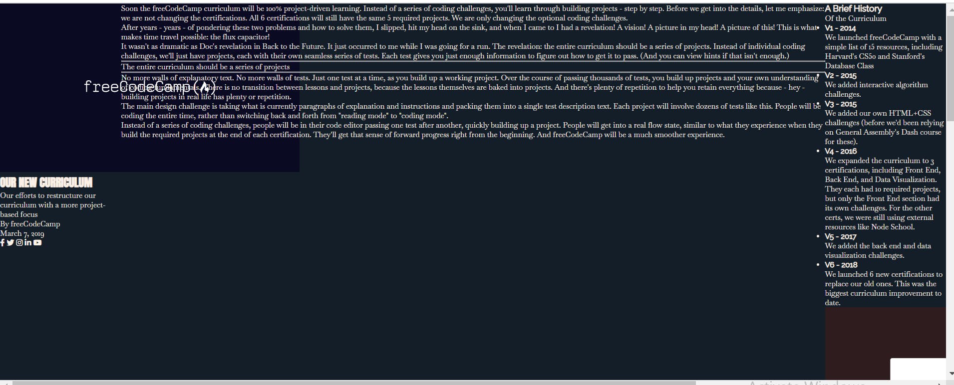
- Gave the main selector a row-gap property of 3rem. (Row-gap property is used to add space between rows in the grid layout).

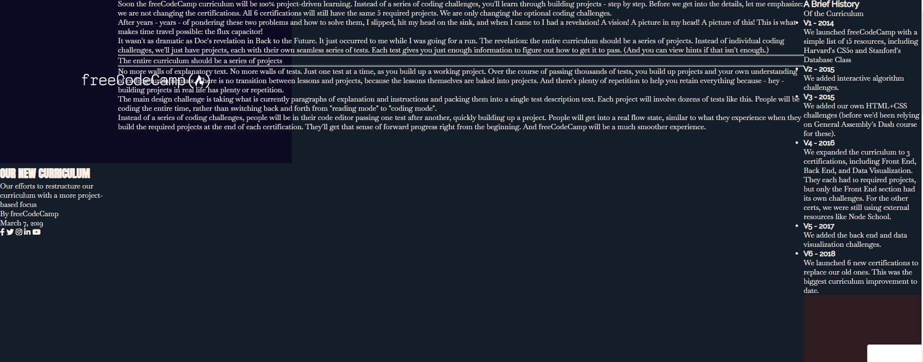
- The magazine has three primary sections. The overall layout has already been set in the main rule, but it can be adjusted in the child rules. One option is the grid-column property, which is shorthand for grid-column-start and grid-column-end. The grid-column property tells the grid item which grid line to start and end at.


- Created a .text selector and gave it a grid-column property set to 2 / 3.

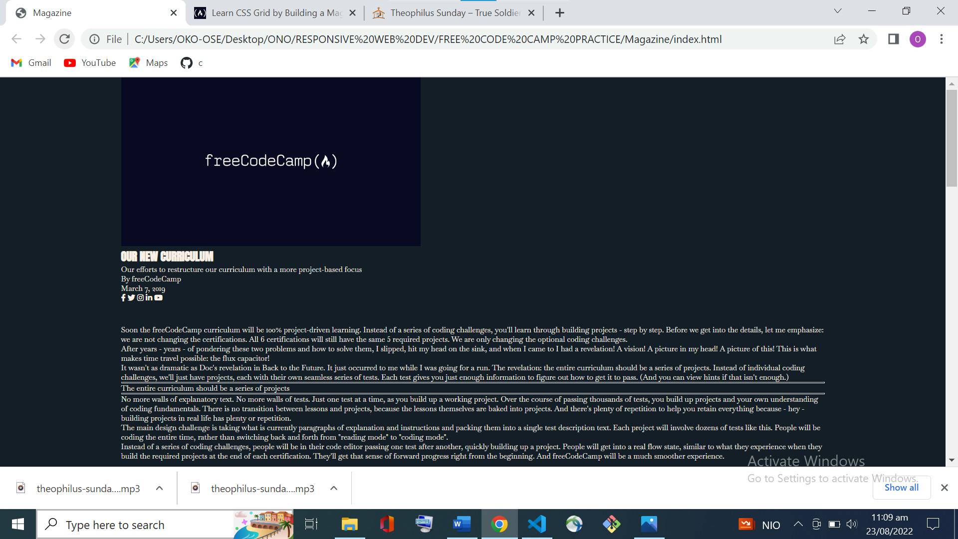
- Set the display property of the .heading selector to grid.

- Gave the .heading element a grid-template-columns property set to repeat(2, 1fr) to create two columns of equal width. (The CSS repeat() function is used to repeat a value, rather than writing it out manually, and is helpful for grid layouts).

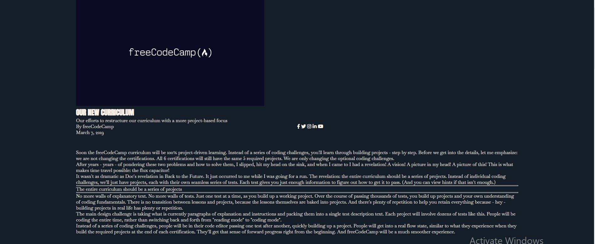
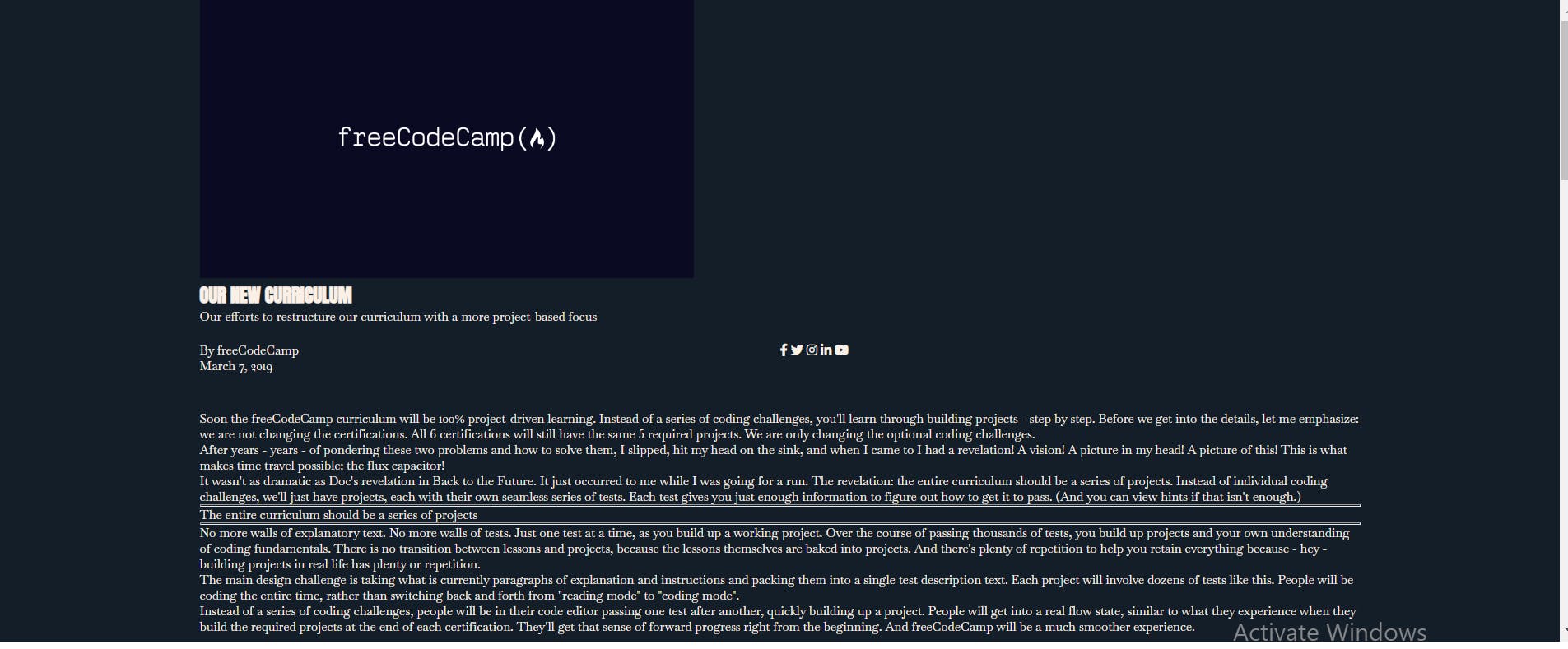
- Gave the .heading selector a row-gap property set to 1.5rem.

 That is certainly alot for one day. See you tomorrow. Bye!
