Hi everyone! I continued with learning CSS grids by building a magazine. Here are the 10 steps I took today.
- Gave the .social-icons selector a grid-template-columns property set to repeat(5, 1fr) to arrange the icons in a single row.


- For the .social-icons selector, I set the grid-auto-flow property to column. (The grid-auto-flow CSS property controls how the auto-placement algorithm works, specifying exactly how auto-placed items get flowed into the grid.)

- Gave the .social-icons selector a grid-auto-columns property set to 1fr. (The grid-auto-columns property sets a size for the columns in a grid container. This property affects only columns with the size not set.)


- Gave the .social-icons selector an align-items property set to center. (I just realized a mistake in my html document and I corrected it, this will change the structure of some items on the page).


- Gave the .text selector a font-size property set to 1.8rem and a letter-spacing property set to 0.6px.

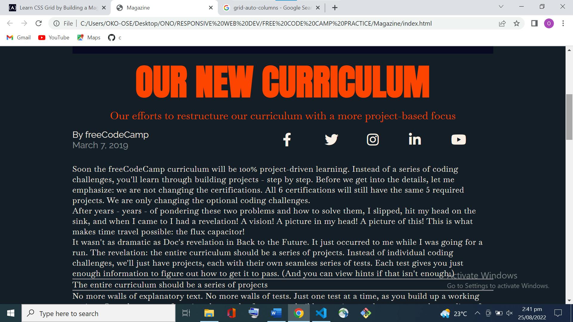
- Gave your .text selector a column-width property set to 25rem.

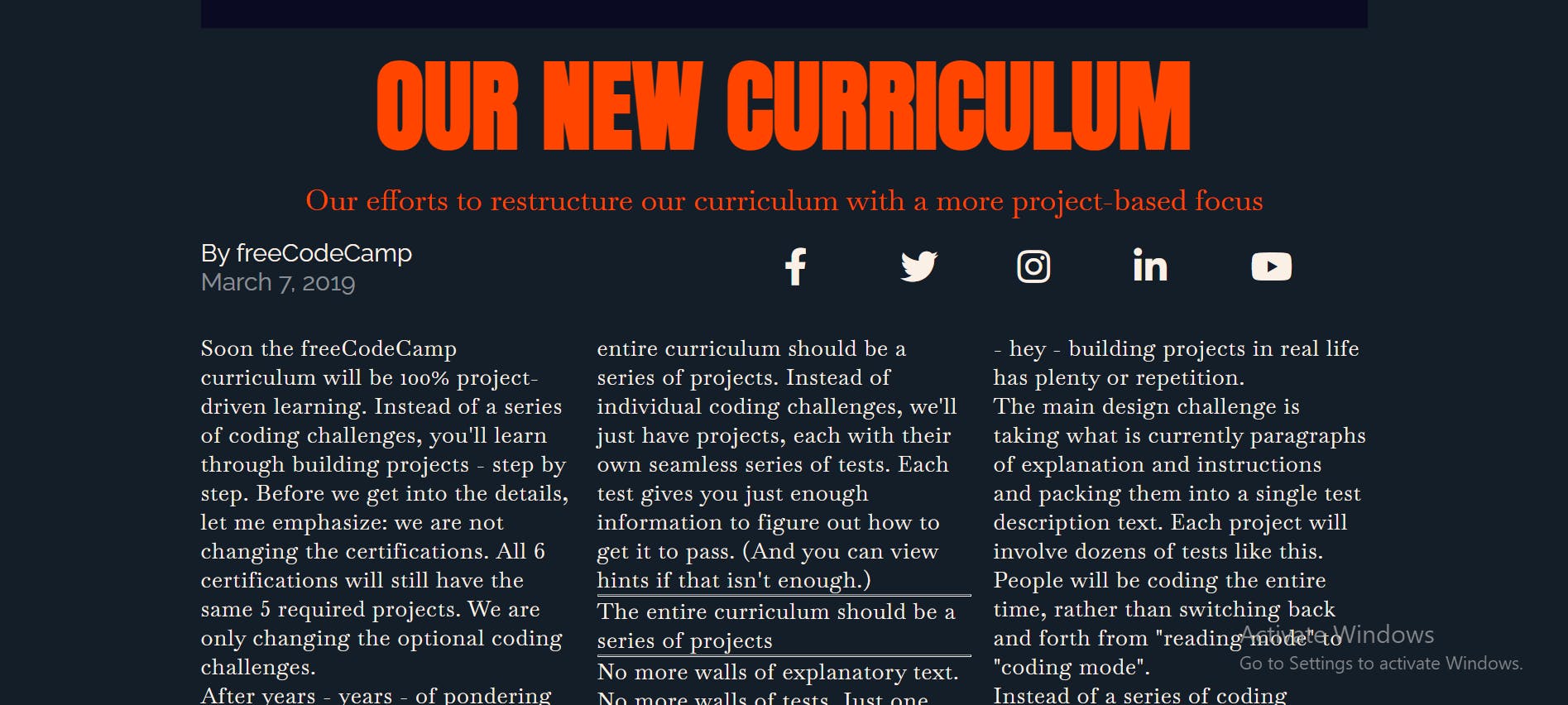
- To make your project look like a printed magazine, give the .text selector a text-align property set to justify.

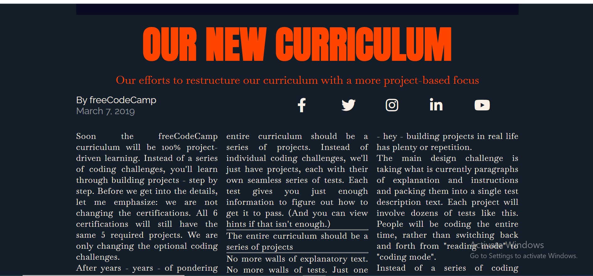
- Created a .first-paragraph::first-letter selector and set the font-size property to 6rem. Also gave it a color property set to orangered to make it stand out.

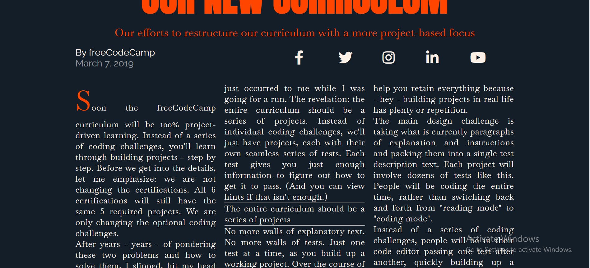
- The other text has been shifted out of place. Move it into position by giving the .first-paragraph::first-letter selector a float property set to left and a margin-right property set to 1rem.

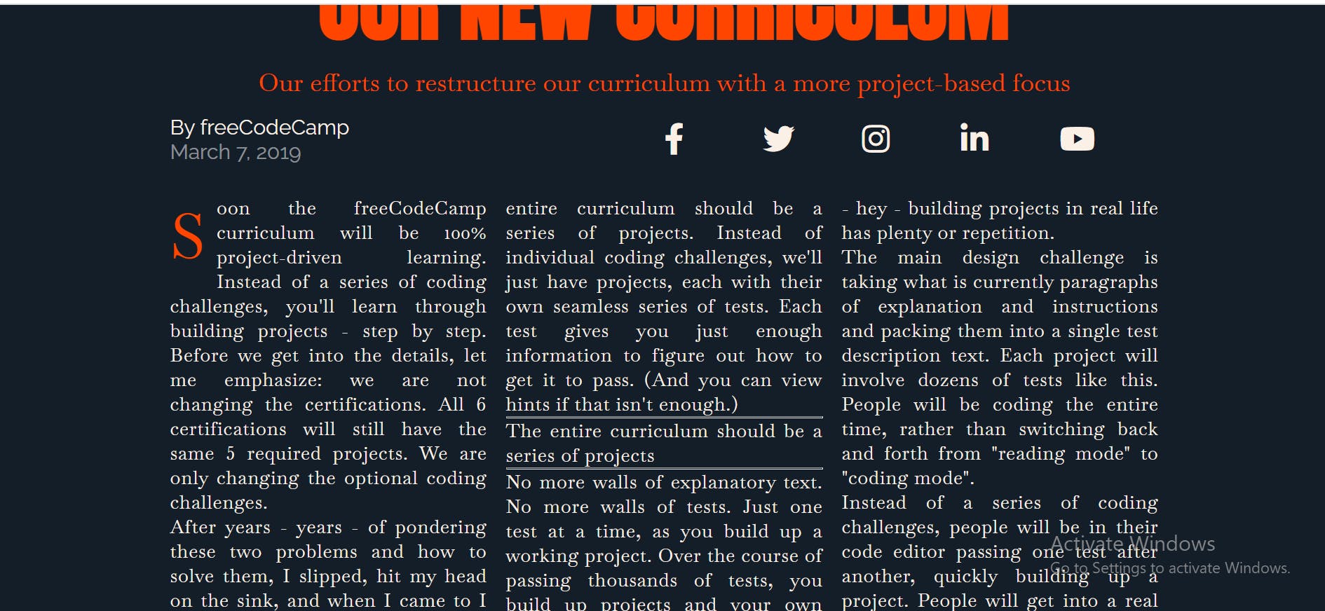
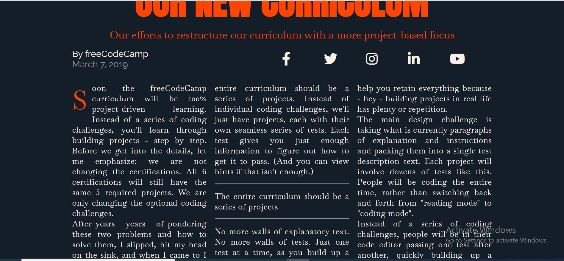
- Created an hr selector, and gave it a margin property set to 1.5rem 0.

 I have to run now. See you tomorrow. Thanks for reading.
