Day 67: Learning CSS Transformation by Building a Penguin
Published
•2 min read
Hiya. Last time I started learning CSS Transformation by building a penguin. These are the 10 steps I made:
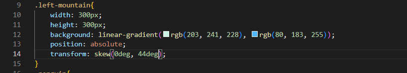
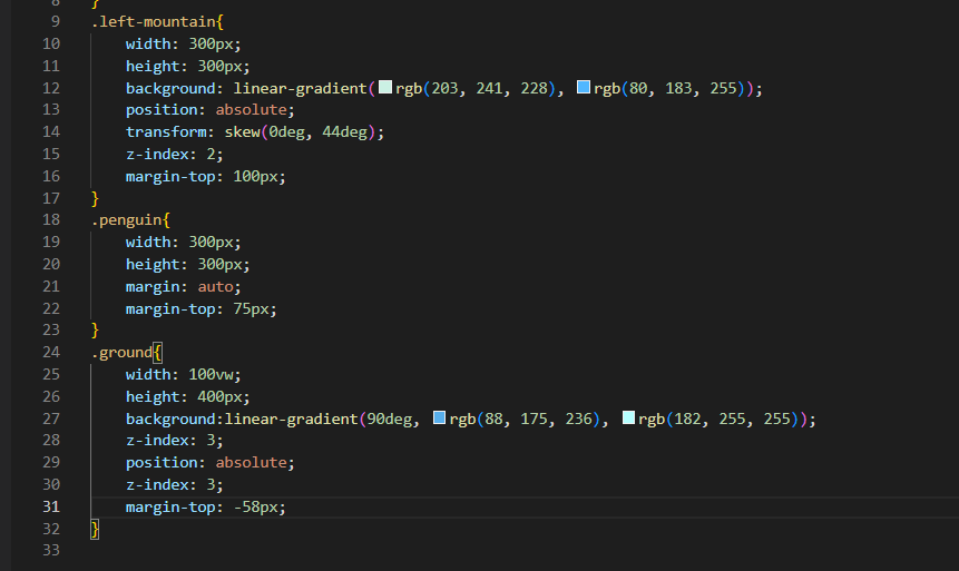
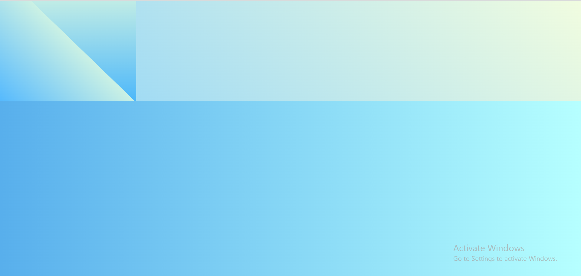
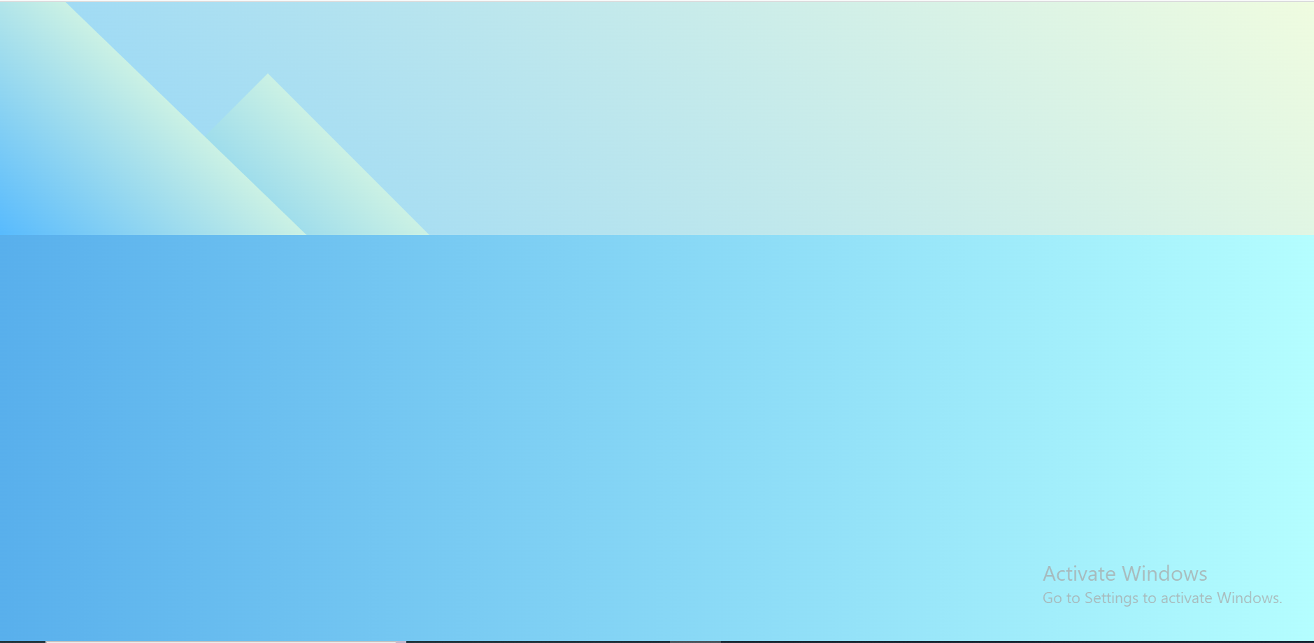
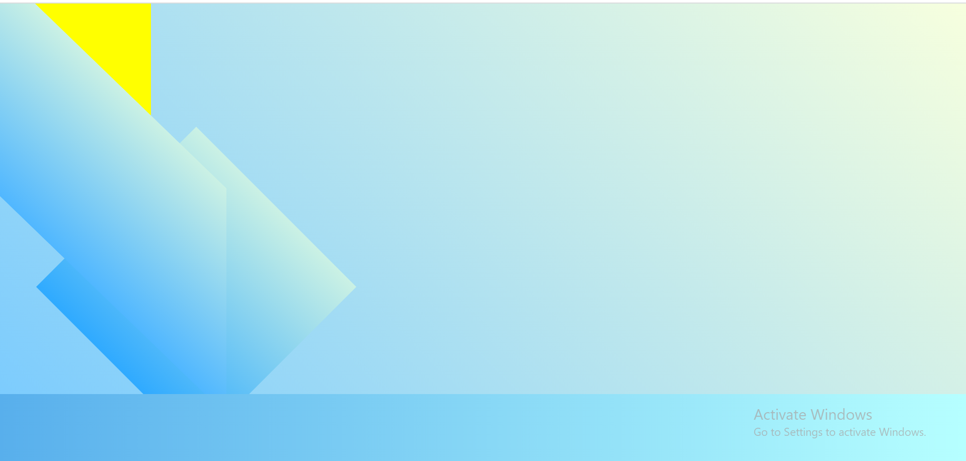
- To make the mountain look more like a mountain, I used the skew transform function to skew the mountain by 0deg in the x-axis and 44deg in the y-axis.

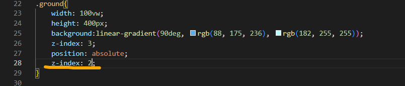
- Set the stack level of the mountain element such that it remains directly behind the .ground element by using the z-index property.

- To overlap the mountain and .ground elements better, give the mountain a margin-top of 100px, and the .ground element a margin-top of -58px.

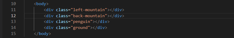
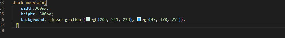
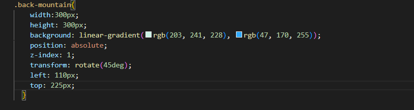
- To give the effect of a mountain range, I added another mountain, by creating a new div immediately after .left-mountain, and gave the new div the class of back-mountain.
- Targeted the .back-mountain element, and set its width and height to 300px. Then, set the background to a linear gradient starting at rgb(203, 241, 228) and ending at rgb(47, 170, 255).

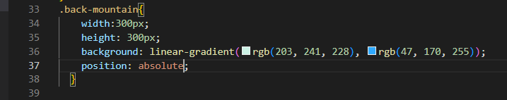
- I then set the position property of the .back-mountain to prevent it from taking up space in the page layout.

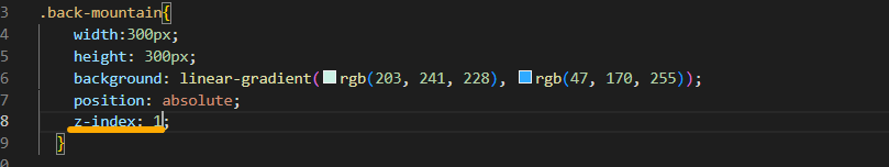
- Changed the stack level of the .back-mountain element such that it is directly behind the .left-mountain element.
- Rotate the .back-mountain element by 45deg clockwise. Then, give it a left property of 110px, and a top property of 225px.
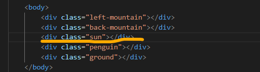
- To finish the background, I added a sun, by creating a new div element immediately after the .back-mountain element, and gave it the class of sun.
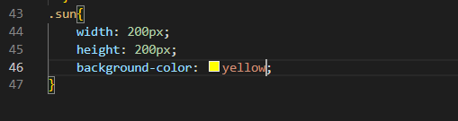
- Gave the .sun element a width and height of 200px, and a background-color of yellow.
 Thank you for reading. That's all for today. Looking forward to your responses. See y'all tommorow.


